Messenger Kids Tests New Design

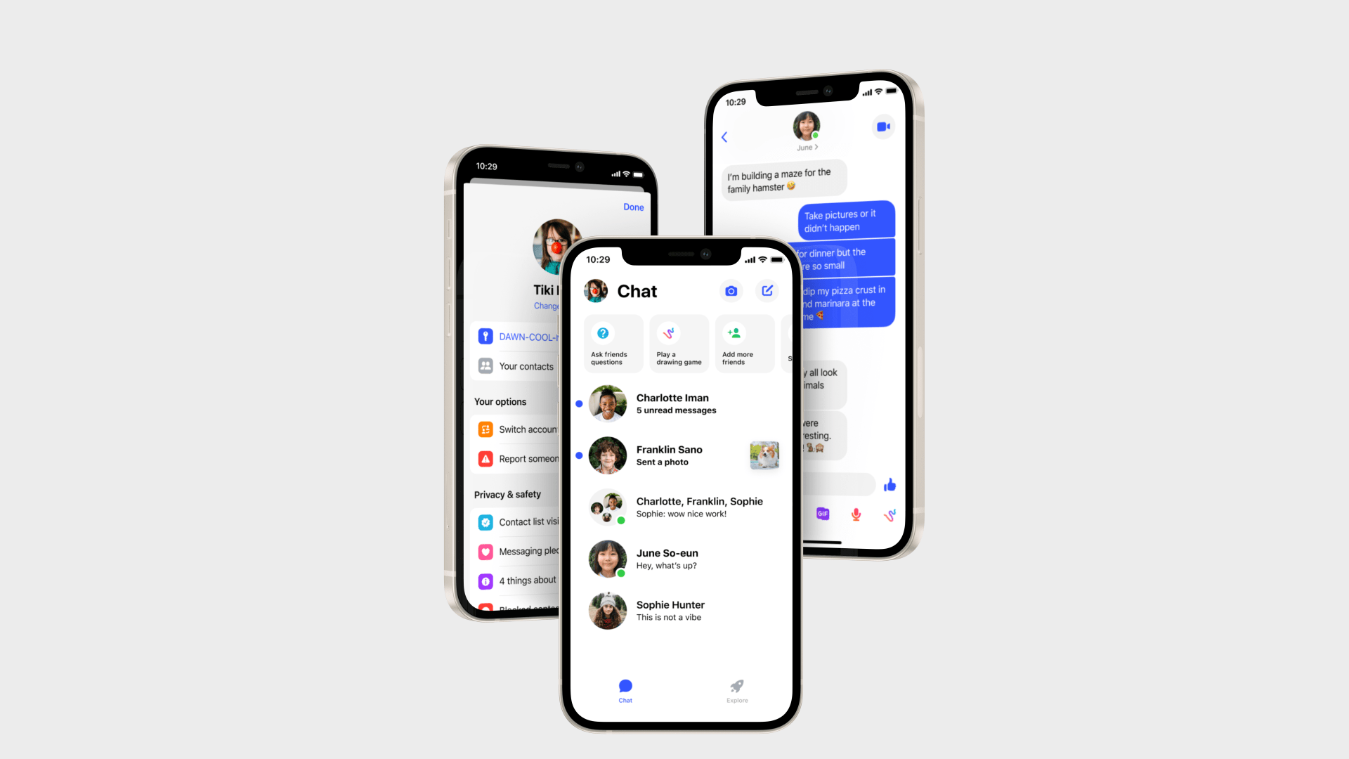
We’re starting to test a new Messenger Kids app design to make it easier for kids to interact with their friends, navigate the app and personalize their chats. We worked closely with kids and parents to understand what they loved about Messenger Kids and what they thought would make it even better – and we’re excited to share this new experience with you. We’re beginning to roll out this new experience today to kids using iPhones in the U.S. and Canada, and will expand to additional countries and device types in the coming months.
Key updates include:
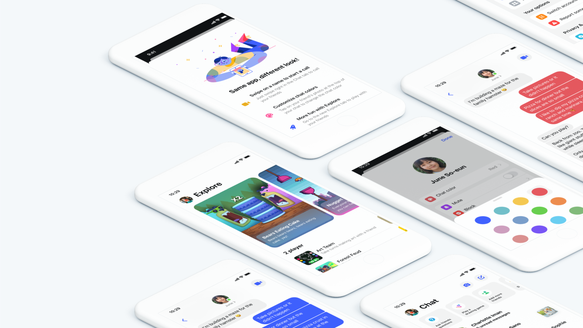
- Dedicated “Chat” and “Explore” navigation tabs at the bottom of the inbox to help kids easily switch between their conversations and in-app activities;
- A more intuitive Chat tab layout which brings the most recently active conversations to the top of the inbox;
- Media and message previews so kids can quickly see updates to their conversations;
- The ability to start a call with a “swipe” gesture straight from the inbox; and
- The option to choose a custom chat bubble color to personalize their 1:1 and group conversations.

What’s not changing: Messenger Kids is still the same app that kids love, with the same controls parents expect. Kids can still video chat their friends, take silly photos with fun filters in the Messenger Kids camera and access the variety of single and multiplayer activities designed just for them. The Messenger Kids Pledge and “4 Things About Your Info” flow, which teaches kids about how their information is used and shared, are still easily accessible in the app.
Parents can still set controls through the Parent Dashboard, including managing their kid’s contacts. Check out our Privacy Matters post to learn more.
For more information about Messenger Kids, visit www.messengerkids.com.
